| Chapter 1. YaST UI | ||
|---|---|---|
 | UI Layout and Events |  |
| Chapter 1. YaST UI | ||
|---|---|---|
| | UI Layout and Events | |
Table of Contents
This is both a tutorial and a reference on how to lay out YaST2 dialogs.
Since experience shows that most people begin this with only a vague perception of YaST2's concepts, it also includes some basics that might be covered in other YaST2 documentation as well - just enough to get started.
If you are in a hurry or - like most developers - you don't like to read docs, you can skip this section and move right on to the next section. That is, if you think you know what the next few headlines mean. You can always come back here later.
Just don't ask anything that is explained here on the yast2-hackers mailing list - you'll very likely just get a plain RTFM answer shot right back into your face. And this is the FM, so read it if you need explanations. ;-)
The UI (user interface) is that part of YaST2 that displays dialogs. It is a separate process which uses a separate interpreter. Always think of it as something running on a different machine: There is the machine you want to install with YaST2 (i.e. the machine where the disks will be formatted etc.) and there is the machine that displays the dialogs - the UI machine. In most cases, this will actually be the same machine. But it doesn't need to be. Both parts of YaST2 might as well run on different machines connected via a serial line, a network or by some other means of communication (telepathy? ;-) ).
The logical consequence of this is that the UI uses its own
separate set of function definitions and variables. You need to be
real careful not to mix that up. Always keep in mind what part of
YaST2 needs to do what and what variables need to be stored where.
You can easily tell by the UI prefix within the YCP code
what parts are getting executed by the UI.
A widget is the most basic building block of the UI. In short, each single dialog item like a PushButton, a SelectionBox or a TextEntry field is a widget. But there are more: Most static texts in dialogs are widgets, too. And there are a lot of widgets you can't see: Layout boxes like HBox or VBox and many more that don't actually display something but arrange other widgets in some way.
See the widget reference for details and a list of all available widgets.
There are several different UIs for YaST2. There is the Qt based UI (y2qt) as a graphical frontend which requires the X Window System; this is what most people know as the "normal" YaST2 UI. But there is also a NCurses based UI (y2ncurses) for text terminals or consoles.
That means, of course, that all YaST2 dialogs need to be written in a way that is compatible with each of those UIs. This is why libyui was introduced as an intermediate abstract layer between the YCP application and the UI. You do not communicate directly with either y2qt, y2ncurses - you communicate with the libyui.
Thus, YaST2 dialogs need to be described logically rather than in terms of pixel sizes and positions: You specify some buttons to be arranged next to each other rather than at positions (200, 50), (200, 150), (200, 200) etc. - whatever exactly this "next to each other" means to the specific UI.
Add to that the fact that there are several dialog languages to choose from: User messages or button labels have different lengths in different languages. Just compare the length of English messages to those in German or French, and you'll discover another good reason not to hard-code coordinates.
In addition to that, always keep in mind that the same dialog might require a different amount of space in a different UI. Overcrowded dialogs don't look good in the Qt UI. In the NCurses UI, they will very likely break completely: There simply isn't as much space available (80x25 characters vs. 640x480 pixels).
Each widget has a so-called nice size - this is the size the widget would like to have in order to look nice. E.g. for PushButtons that means the entire button label fits into the button. Likewise for labels.
Then there are widgets that don't have a natural nice size. For example, what size should a SelectionBox get? It can scroll anyway, so anything that makes at least one line of the list visible will satisfy the basic requirements. More space will make it look nicer; but how much is enough? The widget cannot tell that by itself.
Such widgets report a somewhat random size as their nice size. This is a number chosen for debugging purposes rather than for aesthetics. You almost always need to specify the size from the outside for that very reason. Always supply a weight for such widgets or surround them with spacings.
By default, all dialogs will be as large as they need to be - up to full screen size (which is UI dependent - 640x480 pixels for Qt, 80x25 characters for NCurses): The outermost widget is asked what size it would like to have, i.e. its nice size. If that outermost widget has any children, for example because it is a layout box, it will ask all of its children and sum up the individual sizes. Those in turn may have to ask their children and so on. The resulting size will be the dialog's initial size - unless, of course, this would exceed the screen size (UI dependent, see above).
You can force full screen size for any dialog by setting the
`defaultsize option when opening it:
OpenDialog(
           `opt(`defaultsize ),
           `VBox(...)
          );
This will create a dialog of 640x480 pixels (y2qt) or 80x25 characters (y2ncurses) - regardless of its contents.
Use this for main windows or for popup dialogs with very much the same semantics - e.g. many of the YaST2 installation wizard's "expert" dialogs. Even though they are technically popup dialogs and they return to the main thread of dialog sequence they have main window semantics to the user.
Use your common sense when considering whether or not to use this feature for a particular dialog.
Note: Not every UI may be capable of this feature. This is only a hint to the UI; you cannot blindly rely on it being honored.
This section covers the widgets used for creating dialog layouts - the kind of widgets that are less obvious to the user. If you are interested in the "real" widgets, i.e. the kind you can actually see, please refer to the widget reference.
This is the most basic and also the most natural layout widget. The HBox widget arranges two or more widgets horizontally, i.e. left to right. The VBox arranges two or more widgets vertically, i.e. top to bottom.
The strategy used for doing this is the same, just the dimensions (horizontal / vertical) are different. Each child widget will be positioned logically next to its neighbor. You don't have to care about exact sizes and positions; the layout box will do that for you.
See the description of the layout algorithm for details.
For creating more complex layouts, nest HBox and VBox widgets into each other. Usually you will have a structure very much like this:
`VBox(
      `HBox(...),
      `HBox(...),
      ...
      )
i.e. a VBox that has several HBoxes inside. Those in turn can have VBoxes inside etc. - nest as deep as you like.
Almost every kind of layout can be broken down into such columns (i.e. VBoxes) or rows (i.e. HBoxes). If you feel you can't do that with your special layout, try using weights.
By default, each widget in a layout box (i.e. in a HBox or a VBox) will get its nice size, no more and no less. If for any reason you don't want that, you can exactly specify the proportions of each widget in the layout box. You do that by supplying the widgets with a weight (to be more exact: by making it the child of a weight widget, a HWeight or a VWeight).
You can specify percentages for weights, or you can choose random numbers. The layout engine will add the weights of all children of a layout box and calculate percentages for each widget automatically. Specify a HWeight for HBox children and a VWeight for VBox children.
Example 1.1. Specifying Proportions 1
`HBox(
      `HWeight( 20, `PushButton( "OK"     ) ),
      `HWeight( 50, `PushButton( "Cancel" ) ),
      `HWeight( 30, `PushButton( "Help"   ) )
     )
In this example, the "OK" button will get 20%, the "Cancel" button 50% and the "Help" button 30% of the available space. In this example, the weights add up to 100, but they don't need to.
Note: This dialog looks extremely ugly - don't try this at home, kids ;-)
The weight ratios will be maintained at all times, even if that means violating nice size restrictions (i.e. a widget gets less space than it needs). You are the boss; if you specify weights, the layout engine assumes you know what you are doing.
Example 1.2. Specifying Proportions 2
(See also creating widgets of equal size in the common layout techniques section)
`HBox(
      `HWeight( 1, `PushButton( "OK"     ) ),
      `HWeight( 1, `PushButton( "Cancel" ) ),
      `HWeight( 1, `PushButton( "Help"   ) )
     )
Note: This is a very common technique.
In this example all buttons will get an equal size. The button with the largest label will determine the overall size and thus the size of each individual button.
Please note how the weights do not add up to 100 here. The value "1" is absolutely random; we might as well have specified "42" for each button to achieve that effect.
Example 1.3. Specifying Proportions 3
The YaST2 wizard layout reserves 30% of horizontal space for the help text (a RichText widget) and the remaining 70% for the rest of the dialog. The important part of that code (simplified for demonstration purposes) looks like that:
`HBox(
      `HWeight( 30, `RichText( "Help text") ),
      `HWeight( 70, `VBox(
                          ...   // the dialog contents
                          `HBox(
                                `PushButton( "Back"),
                                `HCenter( `PushButton( "Abort Installation") ),
                                `PushButton( "Next")
                               )
                          )
              )
      )
Specifying the size of the help text like that is important for most kinds of widgets that can scroll - like the RichText widget used here, for example. The RichText widget can take any amount of space available; it will wrap lines by itself as long as possible and provide scroll bars as necessary. Thus, it cannot supply any reasonable default size on its own - you must supply one. We chose 30% of the screen space - which of course is absolutely random but suits well for the purposes of YaST2.
Use this technique for widgets like the SelectionBox, the Table widget, the Tree widget, the RichText, but also for less obvious ones like the InputField.
Note: This list may be incomplete. Use your common sense.
When you don't want parts of a dialog to be resized just because some neighboring widget needs more space, you can insert stretch widgets to take any excess space. Insert a HStretch in a HBox or a VStretch in a VBox. Those will act as "rubber bands" and leave the other widgets in the corresponding layout box untouched.
You can also insert several stretches in one layout box; excess space will be evenly distributed among them.
If there is no excess space, stretch widgets will be invisible. They don't consume any space unless there is too much of it (or unless you explicitly told them to - e.g. by using weights).
Some widgets that are not stretchable by default can be made
stretchable by setting the `hstretch option. PushButtons are typical
candidates for this: They normally consume only as much space as
they really need, i.e. their nice size.
With the `hstretch option, however, they can grow and take
any extra space - very much like stretch widgets.
Please note, however, that all widgets for with a weight are implicitly stretchable anyway, so
specifying `opt(`hstretch) or `opt(`vstretch) for
them as well is absolutely redundant.
Use HSpacing or VSpacing to create some empty space within a layout. This is normally used for aesthetical reasons only - to make dialogs appear less cramped.
The size of a spacing is specified as a float number, measured in units roughly equivalent to the size of a character in the respective UI (1/80 of the full screen width horizontally , 1/25 of the full screen width vertically). Fractional numbers can be used here, but text based UIs may choose to round the number as appropriate - even if this means simply ignoring a spacing when its size becomes zero.
You can combine the effects of a spacing and a stretch if you specify a hstretch or a vstretch option for it: You will have a rubber band that will take at least the specified amount of space. Use this to create nicely spaced dialogs with a reasonable resize behaviour.
Example 1.4. Spacings
`HBox(
      `PushButton( "OK" ),
      `HSpacing( `opt(`hstretch), 0.5),
      `PushButton( "Cancel" )
     )
This will create two buttons with a spacing between them. When the dialog is resized, the spacing will grow.
Alignments are widgets that align their single child widget in some way.
HCenter centers horizontally, VCenter centers vertically, HVCenter centers both horizontally and vertically. The others align their child as the name implies.
More often than not, you could achieve the same effect with a clever combination of spacings, but sometimes this might require an additional HBox within a HBox or a VBox within a VBox, i.e. more overhead.
Sometimes you wish to squeeze any extra space from a part of a dialog. This might be necessary if you want to draw a frame around a RadioBox in a defaultsize dialog: You want the frame drawn as close as possible to the RadioButtons, not next to the window frame with lots of empty space between the frame and the RadioButtons. Use a squash widget for that purpose:
`HVCenter(
          `HVSquash(
                    `Frame( "Select Software categories",
                           `VBox(
                                 ...
                                )
                          )
                   )
         )
This is not exactly a layout-only widget - you can see it. It is being mentioned here more because like layout widgets it can have children.
Use a Frame to visually group widgets that logically belong together - such as the RadioButtons of a RadioBox or a group of CheckBoxes that have a meaning in common (e.g. individual file permissions, software categories to install, ...).
Note: Do not overuse frames. They have a nice visual effect, but only if used sparingly.
You may need to put a squash widget around the frame in order to avoid excessive empty space between the frame and its inner widgets.
The RadioButtonGroup is a widget go logically group individual RadioButton widgets. It does not have a visual effect or an effect on the layout. All it does is to manage the one-out-of-many logic of a RadioBox: When one RadioButton is selected, all the others in the same RadioBox (i.e. in the same RadioButtonGroup) must be unselected.
Please notice that this might not be as trivial as it seems to be at first glance: There might be some outer RadioBox that switches between several general settings, enabling or disabling the others as necessary. Any of those general settings might contain another RadioBox - which of course is independent of the outer one. This is why you really need to specify the RadioButtonGroup.
You usually just surround the VBox containing the RadioButtons with a The RadioButtonGroup.
Don't forget to include your RadioBox within a frame! RadioButtonGroup, Frame and HVSquash usually all come together.
Example 1.5. Grouping RadioButtons
`HVCenter(
          `HVSquash(
                    `Frame( "Select Installation Type",
                           `RadioButtonGroup(
                                             `VBox(
                                                   `RadioButton(...),
                                                   `RadioButton(...),
                                                   `RadioButton(...)
                                                  )
                                            )
                          )
                   )
         )
A ReplacePoint
is a "marker" within the widget hierarchy of a layout. You can
later refer to it with ReplaceWidget(). Use this to cut
out a part of the widget hierarchy and paste some other
sub-hierarchy to this point.
The YaST2 wizard dialogs use this a lot: The main window stays the same, just some parts are replaced as needed - usually the large part to the right of the help text, between the title bar and the "previous" and "next" buttons.
A ReplacePoint has no other visual or layout effect.
Use the case studies in this section as building blocks for your own dialogs.
Remember that even though most of the examples use a horizontal layout (a HBox), the same rules and techniques apply in the vertical dimension as well - just replace HBox with VBox, HWeight with VWeight etc.

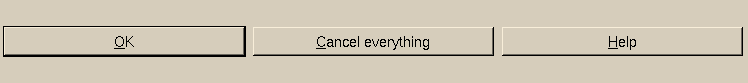
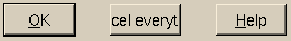
Screen shot of the Layout-Buttons-Equal-Growing.ycp example
You can easily make several widgets the same size - like in this example. Just specify equal weights for all widgets:
`HBox(
      `HWeight(1, `PushButton( "OK"                ) ),
      `HWeight(1, `PushButton( "Cancel everything" ) ),
      `HWeight(1, `PushButton( "Help"              ) )
     )
The widgets will grow or shrink when resized. They will always retain equal sizes:
The same example, resized larger.
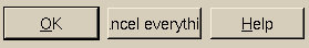
The same example, resized smaller.

Screen shot of the Layout-Buttons-Equal-Even-Spaced1.ycp example
Widgets with a weight (such as these buttons) are implicitly stretchable. If you don't want the widgets to grow, insert stretches without any weight between them. They will take all excess space - but only if there is no weight specified (otherwise, the stretches would always maintain a size according to the specified weight - not what is desired here).
`HBox(
      `HWeight(1, `PushButton( "OK"                ) ),
      `HStretch(),
      `HWeight(1, `PushButton( "Cancel everything" ) ),
      `HStretch(),
      `HWeight(1, `PushButton( "Help"              ) )
     )
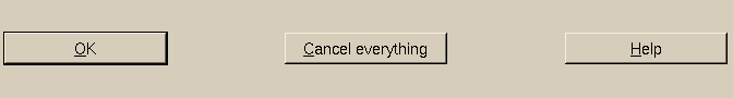
The same example, resized larger. Notice how the stretches take the excess space.
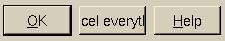
The same example, resized smaller. The stretches don't need any space if there is not enough space anyway.

Screen shot of the Layout-Buttons-Equal-Even-Spaced2.ycp example. Notice the spacing between the buttons.
If you want some space between the individual widgets, insert a spacing. You could use both a spacing and a stretch, but specifying the stretchable option for the spacing will do the trick as well - and save some unnecessary widgets:
`HBox(
      `HWeight(1, `PushButton( "OK"                ) ),
      `HSpacing(`opt(`hstretch), 3),
      `HWeight(1, `PushButton( "Cancel everything" ) ),
      `HSpacing(`opt(`hstretch), 3),
      `HWeight(1, `PushButton( "Help"              ) )
     )
The value "3" used here for the spacing is absolutely random, chosen just for aesthetics. Use your own as appropriate.

The same example, resized larger. Notice how the spacings take the excess space.
The same example, resized smaller.
As you can see, the spacings have one disadvantage here: They need the space you specified even if that means that there is not enough space for the other widgets.
As mentioned before, most kinds of widgets that can scroll don't have a natural nice size. If the overall size of your layout is fixed by some other means (e.g. because it is a full screen dialog), you can have it take the remaining space or specify proportions with weights.
If this is not the case, create such "other means" yourself: Surround the scrollable widget with widgets of a well-defined size, e.g. with spacings.
Prevent the spacings from actually using precious screen space themselves by putting a VSpacing in a HBox or a HSpacing in a VBox - it will resize the corresponding layout box in its secondary dimension. It will take no space in its primary dimension.
Example 1.6. Specifying the Size of Scrollable Widgets
`VBox(
      `HSpacing(40),            // make the scrollable widget at least 40 units wide
      `HBox(
            `VSpacing(10),      // make the scrollable widget at least 10 units high
            `Table(...)         // or any other scrollable widget
           )
     )
See also the Table2.ycp, Table3.ycp, Table4.ycp and Table5.ycp examples.
As a general rule of thumb, use this technique whenever you place a scrollable widget in a non-defaultsize dialog. Don't leave the size of such widgets to pure coincidence - always explicitly specify their sizes.
printf() is your best friend when debugging - every
seasoned programmer knows that. YaST2 has something very much like
that: y2log(), available both in YCP and in the C++ sources.
It is being used a lot, and you can add your own in your YCP code.
Thus, if something strange happens, check the log file - either in
your home directory (~/.y2log) or the system wide log file
(/var/log/y2log).
You can increase the level of verbosity by setting the
Y2DEBUG environment variable to 1 - both in your shell and
at the boot prompt (for debugging during an installation) - boot
with something like
linux Y2DEBUG=1
Log files will be wrapped when they reach a certain size - i.e.
the current log file is renamed to ~/.y2log-1,
~/.y2log-2 etc. or /var/log/y2log-1,
/var/log/y2log-2 etc., and a new log file is begun.
If the layout engine complains about widgets not getting their nice size and tell you to check the layout, please do that before you write a bug report. More often than not that just means that your dialog is overcrowded. That doesn't only raise technical problems: In that case your dialog most likely is too complex and not likely to be understood by novice users. In short, you very likely have a problem with your logical design, not with the layout engine. Consider making it easier or splitting it up into several dialogs - e.g. an easy-to-understand novice level base dialog and an advanced "expert" dialog. Use YaST2's partitioning, software selection and LILO configuration dialogs as examples for how to do this.
You might also consider replacing some widgets with others that don't use as much screen space - e.g. use a ComboBox rather than a SelectionBox, or a ComboBox rather than a RadioBox. But always keep in mind that this just reduces screen space usage, not complexity. Plus, widgets like the ComboBox frequently are harder to operate from a user's point of view because they require more mouse clicks or keys presses to get anything done. Use with caution.
When you created a new dialog or substantially changed an existing one always remember to check it with the other UIs, too. If it looks good with the Qt UI that doesn't mean it looks good with the NCurses UI as well - it might even break completely. There might be too many widgets or parts of widgets may be invisible because of insufficient screen space.
If you don't like that idea always remember some day you might be that poor guy who can't run YaST2 with Qt - maybe because of a brand new graphics card the X server doesn't support yet or maybe because you have to install a server system that just has a serial console.
The text based version may not need to look as good (but it would sure be nice if it did), but it needs to work. That means all widgets must be there and be visible. If they are not, you really need to rearrange or even redesign your dialog. Possibly before somebody from the support department finds it out the hard way - because a user complained badly about it.
Very much the same like the previous issue: Consider somebody who wants or needs to operate your dialog without a mouse. Maybe he doesn't have one or maybe it doesn't work - or maybe he uses the NCurses UI. There are even a lot of users who can work a whole lot quicker if they can use keyboard shortcuts for common tasks - e.g. activating buttons or jumping to text input fields. You can and should provide keyboard shortcuts for each of those kinds of widgets.
Of course this needs to be double-checked with each of the translated versions: Keyboard shortcuts not only are language dependent (so users can memorize them), they are even contained within messages files. The translators need to include their own in the respective language, and that means chances are some of the sort cuts are double used - e.g. Alt-K may be used twice in the same dialog, which renders the second use ineffective. Always check that, too.
You don't need to know the internals of the YaST2 UI layout engine in order to be able to create YaST2 dialogs. But this kind of background knowledge certainly helps a lot when you need to debug a layout - i.e. when a dialog you programmed behaves "strange" and doesn't look at all like you expected.
A HBox lays out its children horizontally, a VBox vertically. How they do that is very much the same except for the dimensions: The HBox uses horizontal as its primary dimension, the VBox vertical. The other dimension is called the secondary dimension (vertical for the HBox, horizontal for the VBox).
Calculating the nice size in the secondary dimension is easy: It is the maximum of the nice sizes of all children. Thus, for a HBox this is the nice height of the highest child, for a VBox this is the nice width of the widest child.
If any child is a layout box itself (or any other container widget), this process will become recursive for the children of that layout box etc. - this holds true for both the primary and the secondary dimension.
In the primary dimension things are a bit more complicated: First, the nice sizes of all children without weights are summed up.
Then the sizes of all children with weights are added to that sum - in such a way that each of those gets at least its nice size, yet all weights are maintained with respect to each other. I.e. when a button is supposed to get 30% he must get it, but its label must still be completely visible.
Maybe some of the children with weights need to be resized larger because of those restrictions. Exactly how large is calculated based on the so-called boss child. This is the one widget that commands the overall size of all children with weights, the one with
max ( nice size / weight )
The boss child's nice size and its weight determine the accumulated nice size of all children with weights. The other children with weights will be resized larger to get their share of that accumulated size according to their individual weights.
By the way this is why all children with weights are implicitly stretchable - most of them will be resized larger so the weights can be maintained at all times.
Each widget has a SetSize() method. This will be called recursively for all widgets from top (i.e. the outer dialog) to bottom. When a dialog is opened, the UI determines how large a dialog should become. The UI tries to use the dialog's nice size, if possible - unless the defaultsize option is set or the nice size exceeds the screen size, in which case the screen size is used.
After the dialog is opened, the SetSize() method will be called again when:
The user resizes a dialog.
A significant portion of the dialog changes - e.g. because of ReplaceWidget().
All of those cases will cause a re-layout of the entire dialog.
For layout boxes, the SetSize() method works like this:
If none of the children of a layout box has a weight, any extra space (i.e. space in excess of the nice size) is evenly distributed among the stretchable children. All non-stretchable children get their nice size, no more.
If there are not any stretchable children, there will be empty space at the end of the layout (i.e. to the right for a HBox and at the bottom of a VBox). If any child has a weight, all children without weights will get no more than their nice sizes - no matter whether or not they are stretchable.
The rest of the space will be distributed among the children with weights according to the individual weights.
There is one exception to that rule, however: If there is more space than the weighted childrens' nice size and there are any stretches or stretchable spacings without weights, the excess space will be evenly distributed among them.
This may sound like a very pathological case, but in fact only this gives the application programmer a chance to create equal sized widgets that don't grow, maybe with a little extra space between them. Simple popup dialogs with some buttons are typical examples for this, and this is quite common.
There should be enough space for any layout box: By default, the overall size of a dialog is calculated based on its nice size. But this might exceed the full screen size, or the user might manually have resized the dialog (some UIs are capable of that) - both of which cases will cause a dialog to get less than its nice size.
If there is not enough space, the layout engine will complain about that fact in the log file, asking you to "check the layout". Please do that if this message always appears when a certain dialog is opened - you may have to rearrange your dialog so all widgets properly fit into it.
Anyway, if it happens, some widgets will get less than their nice size and probably will not look good; some might even be completely invisible.
Even then, as long as there is enough space for all children without weights, those will get their nice sizes. Only the remaining space will be distributed among the children with weights.
If the space isn't even enough for the children without weights, each of them will have to spend some of its space to make up for the loss. The layout engine tries to treat each of them equally bad, i.e. each of them has to give some space.
This behaviour may be somewhat unexpected, but not only is this compatible with older versions of the YaST2 UI, it also comes very handy for simple layout tasks like this (taken from the Label1.ycp example):
`VBox(
      `Label( "Hello, world" ),
      `PushButton( "OK" )
     )
This button will be centered horizontally - without the need for a HCenter around it.
| |  | |
| UI Layout and Events |  | 1.2. UI Events |